Vivint Smart Home has brought many projects. I've done anywhere from motion to illustration to UX design. With that said, I've decided to focus this work more on the UX side of it all.
Creative Direction: Vivint Smart Home marketing
The Problem
Vivint has impressive reviews from customers and various media sources, but lacks a local page to show them off and is buried in negative reviews when Googling for said reviews. We want to capture those keywords and pull our local reviews page and positive reviews above the others so a consumer can get a more accurate first impression of Vivint.
The Research
Consumers rely on customer reviews when making decisions on a product or service. It's an important part and should be simple to digest and research through. Most companies provide their reviews locally, capturing an audience and bringing potential customers to their website. With all of this in mind I tried to keep the experience of this page very straight forward and easy to use.
The Process
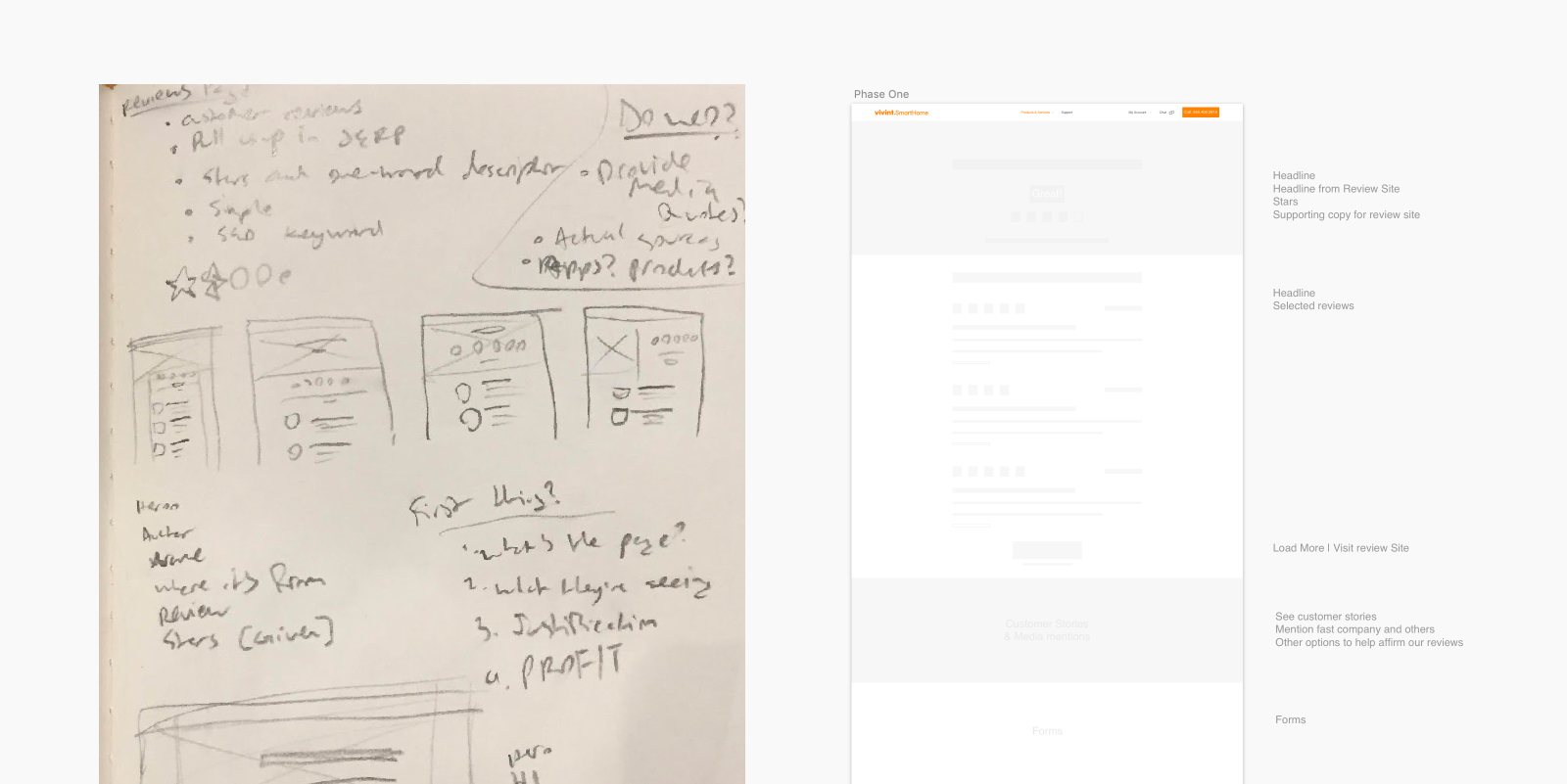
Wielding this knowledge, I set out to create a simple, yet intuitive experience for those consumers. With the inital research out of the way I moved on to sketches, thinking through possible experiences. After sketching out ideas, I built some low-level wires and presented them to my peers to get some inital feedback.

The Solution
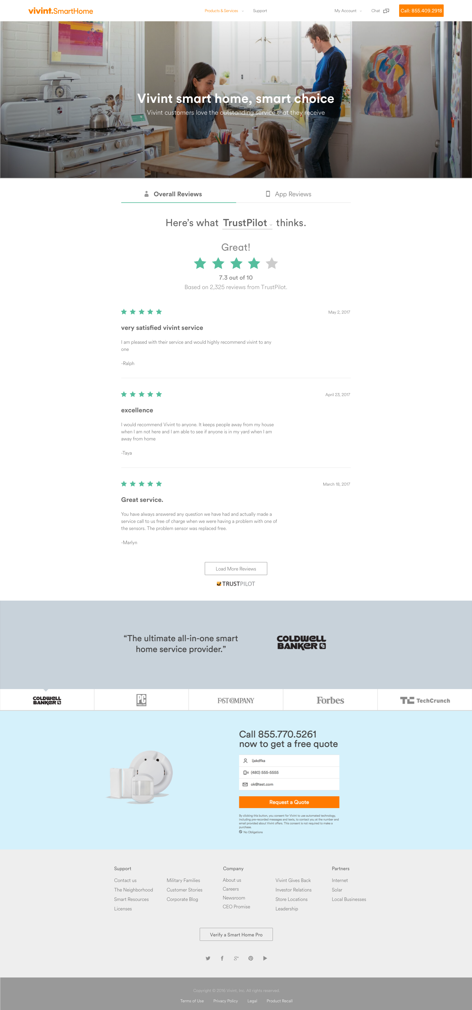
The solution was a one-stop-shop for a consumer on their search for the best reviewed home security system. The page lets them know where they are through a hero image, a short headline and sub-head. Immediately they scroll into the overall rating of Vivint through the use of stars and a word to reflect the rating. They can then browse other review sites, app reviews or continue scrolling to see the detailed reviews. If they would like to see the reviews on the source's page they can reach the page by clicking on the source's name under the stars. This design presents the consumer with what they are looking for and offer the resources to triple check the claims that Vivint exhibits.
